Quantarium’s REAL AI for REAL Estate

At Advaiya, we have the pleasure of running across dozens of amazing companies- in technology, services, and product development. These companies range from fledgling startups to the world’s largest technology companies. With such a large range at play, one might ask what the commonalities are. Indeed, that is the million-dollar question- what is the taproot of greatness in companies of any size? A common answer is “People.” Great people make great companies, or so the logic goes. We believe this is true but only partly so. We believe strongly that the sine qua non of greatness is a combination of people and timing. Markets are dynamic- they change. No doubt, this dynamism does not necessarily spell doom for the incumbents but it does bring into question the need for timed adaptation. The history of business is littered with the carcasses of projects and companies that were “too soon” or “too late.” These stories needn’t bear recitation- we’ve all heard about these “Kodak Moments” a lot. Given this, we get excited when we find companies that seem to have their timing perfectly aligned with Market dynamics. One such company is Quantarium, an Artificial Intelligence company in Bellevue, WA. With a team of Data Scientists, Mathematicians, Commercial Executives, and Entrepreneurs, Quantarium applies AI to the vast and important residential real estate industry. The numbers are staggering- residential real estate is the world’s largest asset class, with a world-wide estimated value of almost $200 Trillion. In the United States, this number is closer to $30 Trillion. Despite the size of the asset-class and market, real estate data is still a developing business. Traditional parts of the Real Estate value chain are often isolated from one another and no particular part has comprehensive, timely, and contextual data at its disposal- in an actionable and time-sensitive set up. This is partly due to infrastructure, partly to culture, and partly because the questions surrounding Real Estate are incredibly complex. Indeed, we find that AI, Deep Learning, and scientific Big Data management are necessary to create an accurate and repeatable analytics platform in this multi-variate industry. That’s why we love Quantarium. With the largest and most sophisticated Data Lake in the business and with the speed, scale, and insight driven by AI, they are enhancing the industry. Consider for instance their AVM solution– the best in class- which helps mortgage owners, Banks, and other financial institutions value their residential real estate assets or their Portfolio Analytics that allows for propensity models, if/then scenarios, and other focused and relevant solutions- game-changing solutions that are directly applicable to today’s housing market. This brings us back to the notion of timeliness. Not all claims around Data and AI were paid off in reality; claims abound. Quantarium however developed these solutions painstakingly and got them right before releasing them into the wild. We believe timing is on their side. We are impressed but not robotic cheerleaders. Much remains to be seen, but from our vantage point, Quantarium is a Real AI company that offers Real value to one of the largest markets on the planet. We, at Advaiya, are happy to be a trusted partner of Quantarium supporting their solution vision for Data and AI in the Real Estate industry.
Why Microsoft Power BI is the leader in business analytics?

Gartner recently positioned Microsoft’s Power BI as a leader in their annual magic quadrant for business intelligence and analytics Platforms. Also, for the second year in the row, Microsoft is placed farthest in vision within the leader’s quadrant. The reason behind this achievement is mainly because of the new exciting features Power BI team releases every month. Let’s have a look at few of the key features released in february and march 2018. 1. Formatting changes: We can now control the labeling of data in scattering and another kind of cartesian charts. This improves the readability of the report and helps in a situation when data labels overflow the bar in charts. You can also change the size and background color. Similarly, the size of the axis labels can also be controlled now to increase the percentage of the chart used by the axis labels. Another formatting feature added is the bar/column padding control. PBI desktop users can now search the analytics/formatting pane. This is helpful because there are many options available under these panes and it has now become easy to browse through them. A live report can be found at Financial Performance Analysis Report to see the formatting changes. 2. Sync slicer: In March, the PBI team delivered the most requested feature on the ideas forum. With the help of sync slicer feature, we can now synchronize all the pages where the sync slicer is applied. This means that if I select any slicer/filter on a page, the same filter selection would be applied to other pages where the sync mode is on. In the following image we can see that four locations are selected on Page 1 When we move to the next page, according to sync slicer information, of these four selected locations should be displayed. Please check the live report at Restaurant Real Time Report 3. Bookmarking: Though bookmarking was released in october 2017 , but now it is generally available. Bookmarking helps users create storytelling like experience. There are many use cases of bookmarks. Collection of bookmarks can help in presenting a series of insights thus enabling storytelling aspect of BI which is important these days. An interesting analysis of Profit Margin is available in this report which illustrates a company’s profit and total sales by changing margin and discount percentage. The Profit-Margin Analysis shows how much of profit would be generated on the specified values of discount, margin and target profit. Click on the image icons on top left corner to see the magic of bookmarks. 4. Custom visuals: One of the main reasons behind the success of PBI is custom visuals. Think of a scenario where you must show your data in the tree visualization format or in box and whisker plot. In other BI tools, you need to create the visualization from scratch thus taking a lot of time. But in Power BI you can make such as visual in few clicks. That is the beauty of custom visuals. There are many custom visuals available in the app source. Let me discuss few of the important custom visuals. TreeViz: TreeViz represents your data in a tree–like structure. It is good when one wants to organize the data hierarchically. Expand the nodes to see the next level in hierarchy. We can add as many levels we want. Funnel by MAQ software: The Funnel with Source custom visual is perfect to track any metric of interest over various stages along with the source of entry of the data point to the funnel. Network visualization and filter: This chart visualizes data as a network which lets you see flow between various categories. Categories are displayed as nodes and are connected via line. The size of the nodes represents the magnitude of a category. The network structure makes it possible to see the connections among many categories. 5. Tool tip: This feature is the latest one which was released in this month. Now we can create visually compelling tooltips which will pop up when you hover over visuals, based on report pages you create in PBI Desktop. These tooltips include all the visuals which are created in the report page of tooltip. This automatically filters the data point of the visual on which mouse is hovered. 5) Tool tip: This feature is the latest one which was released in this month. Now we can create visually compelling tooltips which will pop up when you hover over visuals, based on report pages you create in PBI Desktop. These tooltips include all the visuals which are created in the report page of tooltip. This automatically filters the data point of the visual on which mouse is hovered. These were few of the updates which Power BI releases every month. The Power BI team works continuously on improving and enhancing the capabilities of the entire Power BI ecosystem. This is making Power BI number one choice in the business intelligence and data visualization software industry.
WCF Service on Top Of SharePoint 2016

In this post, I’m going to discuss about WCF service and how WCF service can be developed on top of SharePoint. WCF service works as an individual component that can be hosted on any environment and has no platform dependencies
How to create and deploy Word Add-on in SharePoint

Office add-in deployment with Com add-in can be very tedious. Here in this post, I am writing about an alternative which is a new Office add-in programming model available for extending Office applications using the JavaScript APIs. Read more.
Unlock the power of workforce data with HR dashboards and reports

We understand that consolidating data from multiple sources, tracking employee engagement, and bridging the gaps within team and management are some of the biggest challenges of an HR executive. With our custom HR dashboards and reports, you can have all your data pulled and presented in one place, visualized through charts, graphs, and other stunning visuals to spot specific trends and measure your company’s progress towards goals. Also, it helps you stay current by scheduling automatic data refresh. Click here to explore the live HR dashboard, and find out how the data filters automatically based on different parameters.
Using SharePoint Document Approval Workflows – Working with metadata and custom content types
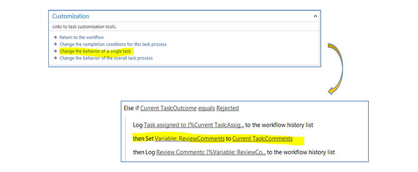
This post talks about the solution to a problem when SharePoint 2013 workflow doesn’t work for document approval workflows.
How to develop & bind custom template with custom content type in SharePoint

In this blog post, I will talk about creating a content type in SharePoint site that anyone can use wherever and whenever needed.
Are you unable to make data-driven decisions?

Regardless the industry and the size of your company, when it comes to making strategic decisions, we often rely on gut feeling, ad-hoc reports or other traditional approaches. A recent study found that 58% of respondents said their companies base at least half of their regular business decisions on gut feel or experiences, rather than on data and information. And, some of the most crucial reasons for not using data for decision making are the lack of data availability and data of poor quality. With the increasing emphasis on data-driven decisions, we can no longer depend on emotions and intuitions. Because, a good decision always need insights from the past, present, and the future. To gain better visibility and control over the data, you need a data-driven culture across the organization. So that everyone can recognize hidden patterns, can find the solution to their unanswered business problems and can make smarter business decisions. For instance, in project portfolio management – from executives to project managers to team members – everyone needs insights at various levels. A team member wants to know the list of tasks, the priorities, and the timeline for these tasks, etc. A project manager wants to know which project is performing well, who is available to work for the project and so on. Executives need to know the overall company portfolio to check the overall business progress and plan investments. They all need data that they can trust to facilitate decisions making and take actions. Advaiya AdValue offers a set of pre-built templates and click-to-deploy BI dashboards available for different roles in the organization to access all relevant project information quickly and make informed decisions on-the-fly. If we talk about marketing, the digital world has changed the way marketing happens. Unlike in the past, marketers today need varied insights before planning their strategies. They want to know the performance of the campaigns executed in the past, platforms that worked well for them, tactics that have given good results and other crucial numbers. Getting an in-depth and unified view of all the relevant information is easier said than done. Because, data is coming from a variety of sources, both internally i.e. within the organization, or externally from social media and other channels. Data-driven marketing help marketers reach the right people with the right message at the right time and make marketing relevant. A study by Forbes states that two-thirds of engaged data-driven marketers are seeing new customers because of data-driven initiatives. Advaiya Adaptive BI services help you monitor and analyze the business health data the way you want so you can take actions right away. From improving the customer experience to increasing efficiency and reducing costs, organizations of all sizes are using business intelligence and data analytics to make smarter and data-driven business decisions to plan better for the future. Do you want to transform data into insight and action? Contact us at connect@advaiya.com or give us call +1-425-256-3123 and let’s get started!
Is your organization truly data-driven?

You are a bank manager. You discover the customer churn rate of your bank which has steadily increased. You realise a loophole in retaining the existing customers of your bank. To validate your instincts, you gather the past six month’s data of customers and hire an analyst to come up with the results quickly. But here is the problem. Analyst working on the project realises that the data has a lot of noise, is not captured at a granular level, is coming from multiple sources, not a single version of the truth and is also limited. Hence insights can’t be drawn at the required time. This results in loss of business. Does this scenario sound familiar to you? The reason behind this grief is the bank is not a data-driven organization. Is your organization data driven? Do you embrace data? Can you provide decision makers of your company with the data they need? Does your organization make business decisions with the help of high quality, noise free, granular data? Are all the data sources integrated at one place providing a single version of the truth? If your answer is yes, then congratulations!! You are indeed a data-driven organization. But if the answer is no, you should infuse analytics in your company. In today’s digital age, we are engulfed with an enormous amount of data. It is an acceptable fact that organizations who have the knowledge to extract insights and decisions based on data would be at a competitive edge rather than the organizations who still have not understood its value. We’re in a digital transformation age where data is more valuable than ever. Companies would only be able to have a competitive edge if they truly understand the power of data and promote the use of data in decision-making. Switching to a data-driven organization usually takes time, but hard work pays off. Constructing this sudden shift is a tedious process but this journey from capturing data to making it trustworthy ensures everybody in the company is on the same page with the most updated information at their fingertips. So how do you turn to a data-driven organization? Below are few points to get started: Information Management: Start capturing the data from the most granular level. Each single field should be detail-oriented. This ensures that every single detail of all the business processes in an organization is identified and stored in databases. Data Integration: Often data does not reside on a single data source. We rely on data warehouses to integrate our disparate data sources. Traditional data warehousing can take up to 6 months to 1 year and significant effort to complete. Surely this is not the right way to stay competitive in today’s ever-changing and ever-evolving data landscape. Is there any solution to optimize the data warehouse lifecycle? This is where automation comes to rescue. We now have self-service data warehouse tools with drag and drop capabilities just like modern BI tools. TimeXtender is a leading data warehouse automation tool which automates the entire cycle of implementing and maintaining a DWH/BI solution. Other notable vendors in this space are Wherescape and Attunity. Next Gen BI Tools: Are you still using traditional BI tools for data integration and reporting? If yes, then you have already lost half the battle. Businesses today can’t wait for weeks or months for the BI reports. And this is where self-service BI tools like Tableau, Power BI, Qlik provide an edge over the traditional IT-centric reporting tools. You can have dashboards/reports in just a few clicks without any involvement of IT. Teamwork and Collaboration: This should be one of the key focus areas to become a data-driven organization truly. Self-service BI tools provide a platform that allows analyst, data scientists, decision makers to work collaboratively and act sensibly on approaches for deriving insights of a company. With the help of collaboration, all the members working on a data intensive project are now able to collaboratively work with real-time access to all the features of a BI tool. Training & Reskilling: Employees should have basic knowledge of reporting skills. Also, the power users of analytics must be reskilled and trained with the latest development in analytics space. This ensures that your organization is well equipped to support value-driven decision making. Welcoming a data-driven approach is vital to your organization. It helps you in making decisions that are informed, intelligent and impactful. To understand more about making powerful decisions that lead to desired results, Register for webinar recording on Make powerful decisions with Power BI